Work / Aspen Dental
Making it easier to say yes to care.
I led digital experience and commerce strategy for a faster, more reassuring way to schedule dental care—meeting new, returning, and emergency patients with the right path from the start.
The context
Access was both the customer problem and the brand promise
Aspen Dental serves customers through a nationwide network of independently owned, dentist-operated practices, supported by shared administrative, marketing, technology, and business services. The model was designed to expand access to comprehensive care in welcoming, judgment-free local offices by reducing the emotional, financial, and practical barriers that keep people from getting treatment.
During this work, the network included roughly 900 offices across 43 states. More than 30,000 patients visited each day, and its independent practices expected to record six million patient visits in 2021.
Yet dental care is unusually easy to postpone. Cost, fear, previous experiences, and the possibility of bad news can keep people from acting until a need becomes urgent. National data reinforces the scale of that hesitation: nearly one in five working-age adults reported going without needed dental care because of cost, while nearly one in five adults may experience moderate to high dental fear or anxiety.
The challenge
The moment someone was ready, booking could not become another barrier
A person looking for emergency treatment has a different sense of urgency than someone scheduling a routine visit. A returning patient should not have to move through the same path as someone visiting for the first time. Treating every patient and every need the same made the experience work harder than it needed to.
The goal was not simply to shorten a form. We needed to understand intent early, reduce unnecessary questions, and help each person reach an appropriate appointment with less uncertainty and effort.
The experience
From a conventional form to a stepped, guided process
We pivoted to a guided booking flow that asked for one meaningful decision at a time. The sequence made the process easier to understand, created visible momentum, and used each response to shape what came next rather than presenting every field at once.
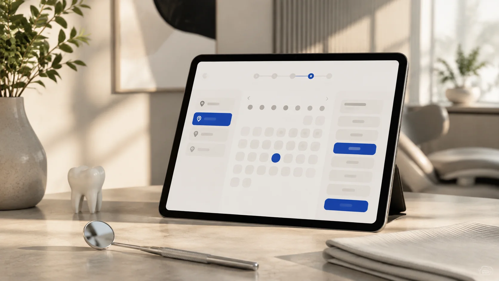
The experience included faster paths for emergency treatment needs and returning patients. That routing respected the patient’s context: urgent visitors could get to care faster, while people already known to the organization could avoid repeating an unnecessarily long new-patient journey.
The stepped structure also made the journey measurable. At every decision point, we could see where patients progressed, hesitated, or left the process—and compare those patterns across desktop and mobile. That data created an ongoing optimization loop: identify friction, test an improvement, and keep simplifying the path to care.
The outcome
70% year-over-year growth in online appointment bookings
Online appointment bookings increased 70% year over year. The experience supported a broader digital journey connected to more than $1 billion in annual treatment-plan value—but the most human measure of progress was simpler: more people moved from considering care to having an appointment on the calendar.
The result showed that conversion in healthcare is not only a commercial measure. When the digital experience reduces uncertainty, recognizes urgency, and removes avoidable work, conversion becomes a measure of access.
Leadership perspective
Design the service, not just the screen
Sustainable conversion improvement required more than interface changes. The experience had to connect patient intent, local office availability, operational rules, analytics, and organizational ownership. The stepped flow made that system understandable to the patient while keeping the complexity behind it out of the way.
That is the leadership lesson I carried forward: the best digital experiences make the organization’s complexity feel simple without ignoring the operational reality required to deliver the promise.